
- Filters/Actions For Post
- Spectra Patterns
- Contact Form 7: Checkbox / Radio / Acceptance Control
- Getting Started With Spectra
- WP – Search
- Create Contact Forms
- Import Single Pages, Templates, & Block Patterns
- Assets API For Third-Party Plugins
- Copy & Paste Style
- Load Google Fonts Locally
- Blocks Editor Spacing
- Translate Everything WPML
- Collapse Panels
- Site Visibility
- Spectra Actions: Clear Cache
- Quick Action Bar
- Custom Blocks
- Move Block Patterns
- Move Title Bar To Top
- Newsletter Forms
- Register High-Privileged Users
- User Roles Access To AI
- Whitelist Email Address
- Hide Core Blocks
- Regenerate Assets With Code
- Using ACF Repeater Field in Spectra
- How to Fix Stretched Spectra Images in WordPress 6.7
- How to Change Breakpoints in Spectra?
- Controlling Access to the Spectra Design Library Based on User Roles
- Multi-Column Form Block Using Utility Classes
- Preview Options (Desktop, Tablet & Mobile)
- Troubleshooting: Missing Icons
- Contact Form 7: Multiple Column Fields
- Unable To Style Contact Form 7
- Tab Index For Multiple Gravity Forms
- Manually Install Spectra Via FTP
- Enable/Disable Design Library Button
- Update Folder File Permissions
- Resolving Container Layout Conflicts
- Database Update Instructions (Below 2.0.0)
- Transparent / Sticky Header
- Change Site Logo
- Change Global Styles
- Disable Title on Posts & Pages
- Transparent / Sticky Header For Single Page / Post
- Change Header & Footer Patterns
- Custom / Google Fonts
- Reset Global Default Styling
- Manually Install Spectra One Via FTP
- Enable / Disable Header & Footer On Specific Pages / Posts
WP – Search
This block lets you add the WordPress search field on the page. This will help users to search for the required information easily. You can customize and color up the search field.
Key Features –
- Inbuilt compact layouts – Classic and Minimal
- Custom Placeholder
- Mange the search box width
- Customize the search button
- Color and typography for every part
General
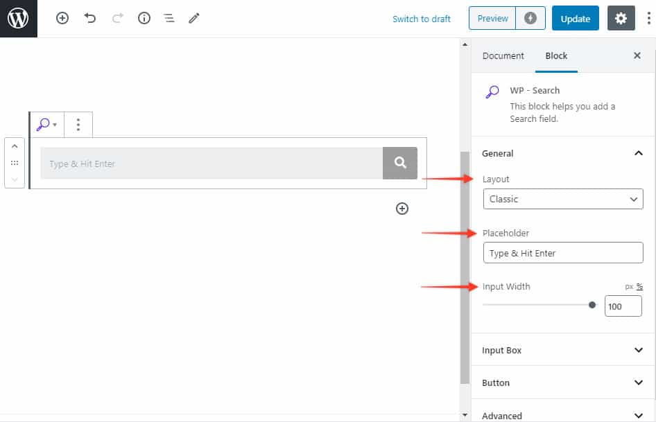
Layout – Classic / Minimal – Classic layout will display search button beside the search bar while Minimal will display just placeholder.
Placeholder – You can set a custom placeholder to guide users the action they need to take.
Input Width – You can manage the width of the search box with this.
Input Box
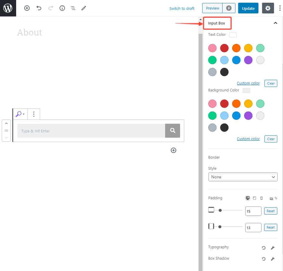
Customize the input box with this. Here are available options –
- Text and Background Color
- Border Style and Color
- Padding
- Typography
- Box Shadow
Search Button
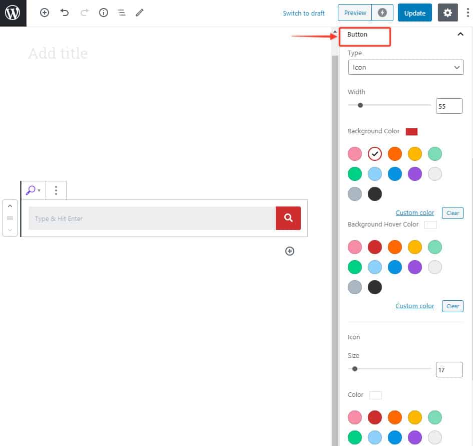
Search button will appear beside the input box when Classic layouts is selected. You can customize this button with –
- Custom Icon
- Width
- Icon and background color
- Hover color
We don't respond to the article feedback, we use it to improve our support content.