
- Filters/Actions For Post
- Spectra Patterns
- Contact Form 7: Checkbox / Radio / Acceptance Control
- Getting Started With Spectra
- WP – Search
- Create Contact Forms
- Import Single Pages, Templates, & Block Patterns
- Assets API For Third-Party Plugins
- Copy & Paste Style
- Load Google Fonts Locally
- Troubleshooting: Missing Icons
- Contact Form 7: Multiple Column Fields
- Unable To Style Contact Form 7
- Tab Index For Multiple Gravity Forms
- Manually Install Spectra Via FTP
- Enable/Disable Design Library Button
- Update Folder File Permissions
- Resolving Container Layout Conflicts
- Database Update Instructions (Below 2.0.0)
- Using Heading Block
- Buttons
- Post Grid
- Content Timeline
- Social Share
- Google Map
- Add Testimonials
- Info Box
- Section
- Team
- Icon List
- Price List
- Post Masonry
- Post Carousel
- Post Timeline
- Call To Action
- Advanced Columns
- Blockquote
- Marketing Button
- Table Of Contents
- How-to Schema
- FAQ’s: Schema/Accordion
- Inline Notice
- Exclude Heading From TOC
- Review Schema
- Lottie
- Taxonomy List
- Tabs Block
- Block Display Conditions
- Star Rating
- Masonry Image Gallery
- Wireframe Blocks
- Copy & Paste Style
- Container Flex Property
- Default Content Width
- Heading Block
- Image Block
- Buttons Block
- Container Block
- Responsive Conditions
- Taxonomy Styling Options
- Block Presets
- Image Gallery
- Counter Block
- Modal Block
- Registration Form Block
- Dynamic Content Extension
- Slider Block
- Pagel Level Custom CSS
- Countdown Pro
- Slider Custom Navigation
- Loop Builder
- Animations
- Login Form Block
- Global Block Style Extension
- Create Popups
- Grid Builder
- Using Dynamic Content in FSE Templates
- Pixabay Image Search Feature
- Getting Started with Instagram
- Advanced Loop Builder
- Transparent / Sticky Header
- Change Site Logo
- Change Global Styles
- Disable Title on Posts & Pages
- Transparent / Sticky Header For Single Page / Post
- Change Header & Footer Patterns
- Custom / Google Fonts
- Reset Global Default Styling
- Manually Install Spectra One Via FTP
- Enable / Disable Header & Footer On Specific Pages / Posts
Add Testimonials to Your WordPress Website
Testimonials on a website are like short reviews from people who’ve tried a product or service. They share positive experiences to show others that the product or service is good.
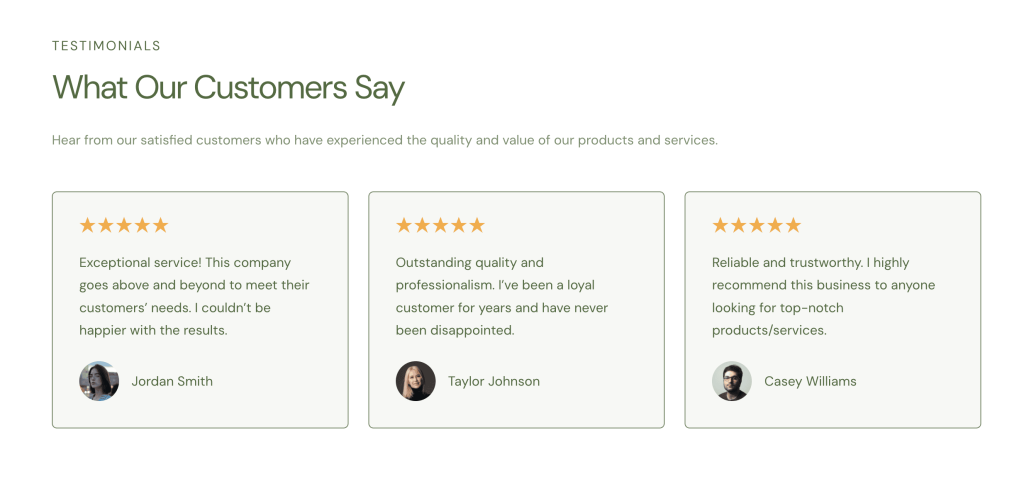
This helps build trust, as it shows that other people like and trust the product. This also encourages customers to purchase because they see that others have had positive experiences.
In this article, we’ll teach you how to make a testimonial for your website with these important features:
- Choose images and position them.
- Add the client’s name, company, and testimonial.
- Customize how testimonials show.
- Pick colors and fonts.
- Adjust space around testimonials.
- Customize background and borders.
- Make sure testimonials look good on all devices.
Let’s begin!
How to Add the Testimonial Block In Spectra
To add the testimonial block, head to the desired page and:
- Click on the “+” icon and add the Testimonials block.
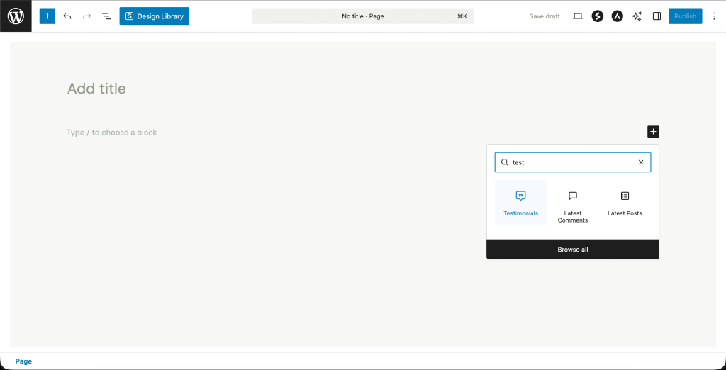
- You can edit the content inside the editor directly.
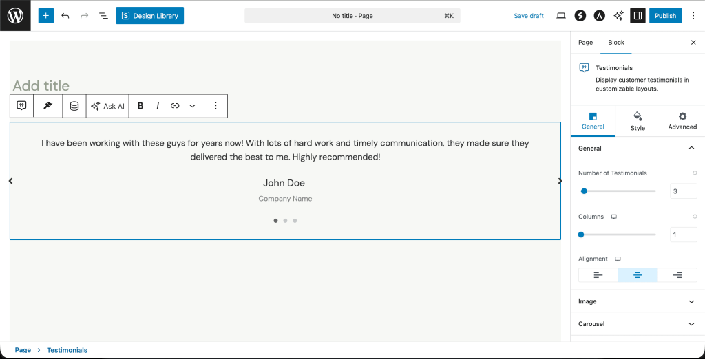
- “Number of Testimonials” decides the number of testimonial items you want to keep. You will find these settings under General > General.
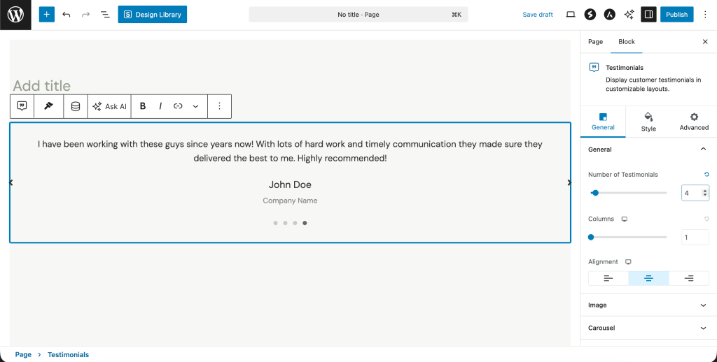
- Lets you display testimonials in columns.
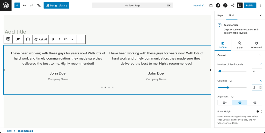
- You can also align the content inside your testimonial to either left, center, or right.
- Click on these device icons to check how your testimonials look on mobile, tablet, or computers.
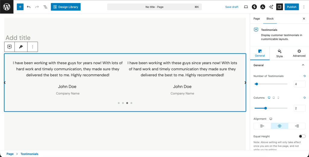
Add Client Images to Your Testimonials
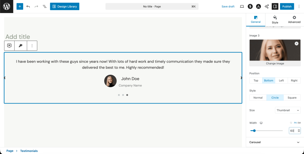
These are usually the client photos or company logos featured along with the client review. You can customize the image settings for each testimonial under General > Image.
Note: Some of these options are exclusively available with Spectra Pro.
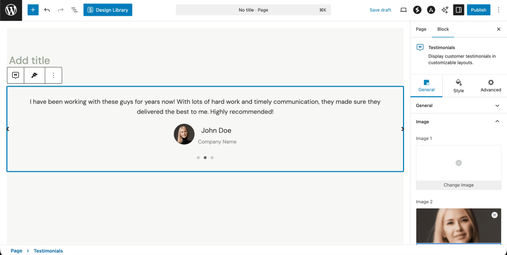
These settings will be visible to you after uploading an image:
- You can position the image to the top, bottom, right, or left of the review text.
- Display the client image in a circular or square outline here.
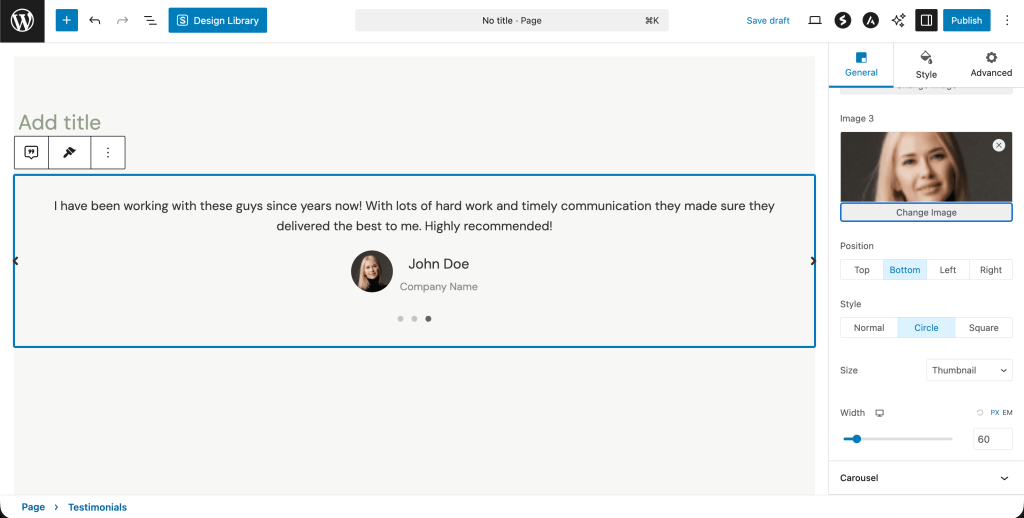
- Customize the size and width of your image here.
Carousel Settings
Testimonial carousels on websites showcase customer reviews in a slideshow format. Here are some carousel settings in Spectra:
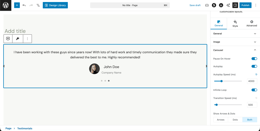
- Enable Pause on Hover if you want the slideshow to stop when the user hovers their mouse over it.
Enabling Autoplay will allow your testimonials to slide continuously one after the other just like the one above. You can even adjust the speed at which these slides move.
- Transition vs Autoplay speed.
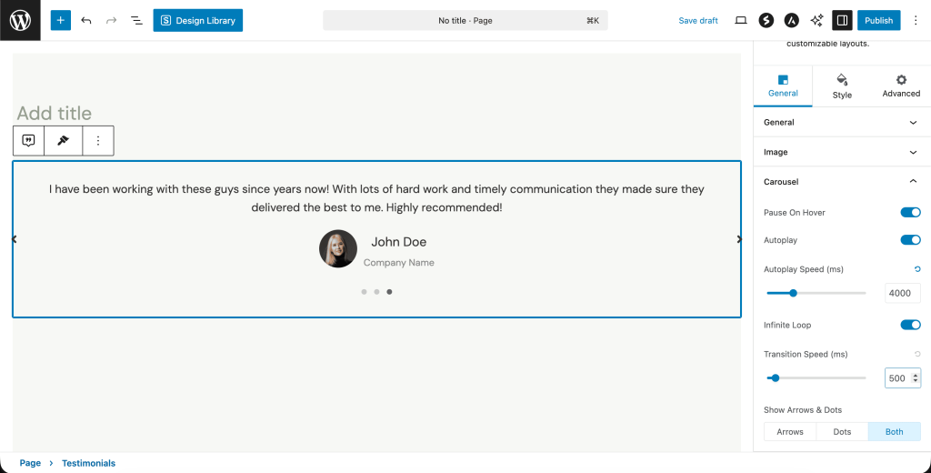
Autoplay speed decides how long each testimonial stays before moving to the next one, while transition speed is how quickly it transitions or lands on to the next testimonial.
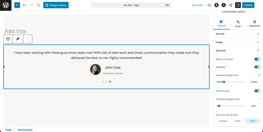
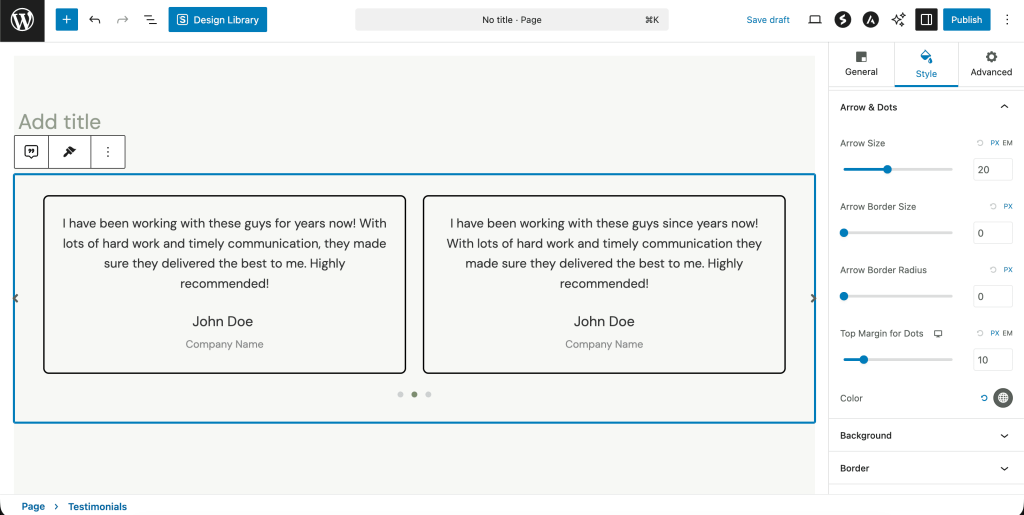
- You can show either or both arrows and dots as a way of navigating between different testimonials.
Styling Your Testimonials
We will cover some of the basic styling options that come with each testimonial component here.
- You can change the text content color and typography under the Style tab. For example, if you want to change the color of the review text, go to Style > Content.
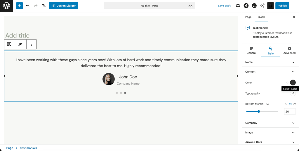
Similarly, you can change the name and the company color/typography under their respective fields.
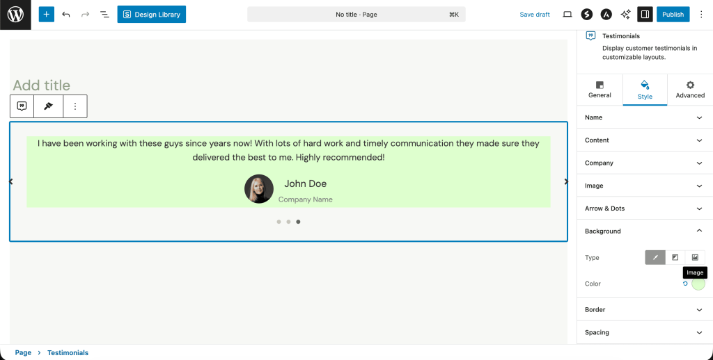
- You can add a background color or image to the whole testimonial section under Style > Background.
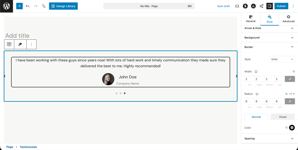
- Under Style > Border, you can select the type of bordering style, width, and color you want to surround your testimonials with.
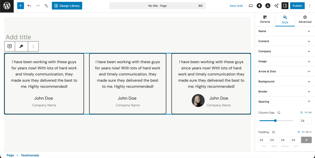
- If you are showing testimonials in columns, Style > Spacing will help you adjust the gap and padding between each column.
- Colors, margins, and borders for the navigation arrows/dots can be set under Style > Arrows & Dots.
That’s it! We hope this guide proves helpful to you. For any questions, please feel free to reach out to us.
We don't respond to the article feedback, we use it to improve our support content.