
- Using Heading Block
- Buttons
- Post Grid
- Content Timeline
- Social Share
- Google Map
- Add Testimonials
- Info Box
- Section
- Team
- Icon List
- Price List
- Post Masonry
- Post Carousel
- Importing Starter Templates With Spectra
- Post Timeline
- Call To Action
- Advanced Columns
- Troubleshooting: Missing Icons
- Filters/Actions For Post
- Blockquote
- Spectra Patterns
- Contact Form 7: Multiple Column Fields
- Contact Form 7: Checkbox / Radio / Acceptance Control
- Unable To Style Contact Form 7
- Marketing Button
- Tab Index For Multiple Gravity Forms
- Getting Started With Spectra
- Manually Install Spectra Via FTP
- Table Of Contents
- How-to Schema
- FAQ’s: Schema/Accordion
- Inline Notice
- WP – Search
- Exclude Heading From TOC
- Review Schema
- Lottie
- Taxonomy List
- Tabs Block
- Block Display Conditions
- Create Contact Forms
- Import Single Pages, Templates, & Block Patterns
- Enable/Disable Design Library Button
- Update Folder File Permissions
- Assets API For Third-Party Plugins
- Star Rating
- Masonry Image Gallery
- Wireframe Blocks
- Copy & Paste Style
- Coming Soon Mode
- Load Google Fonts Locally
- Container Flex Property
- Default Content Width
- Blocks Editor Spacing
- Heading Block
- Image Block
- Buttons Block
- Translate Everything WPML
- Container Block
- Collapse Panels
- Responsive Conditions
- Taxonomy Styling Options
- Block Presets
- Image Gallery
- Counter Block
- Modal Block
- Registration Form Block
- Dynamic Content Extension
- Slider Block
- Pagel Level Custom CSS
- Countdown Pro
- Slider Custom Navigation
- Instagram Feed
- Loop Builder
- Animations
- Login Form Block
- Site Visibility
- Global Block Style Extension
- Spectra Actions: Clear Cache
- Create Popups
- Quick Action Bar
- Custom Blocks
- Move Block Patterns
- Grid Builder
- Move Title Bar To Top
- Resolving Container Layout Conflicts
- Newsletter Forms
- Register High-Privileged Users
- User Roles Access To AI
- Database Update Instructions (Below 2.0.0)
- FAQ's: VIP Priority Support
- Whitelist Email Address
- Hide Core Blocks
- Regenerate Assets With Code
- Using ACF Repeater Field in Spectra
- Pixabay Image Search Feature
- Getting Started with Instagram
- How to Fix Stretched Spectra Images in WordPress 6.7
- How to Change Breakpoints in Spectra?
- Controlling Access to the Spectra Design Library Based on User Roles
- Advanced Loop Builder
- Multi-Column Form Block Using Utility Classes
- Why Am I Seeing Mixed Content or Non-HTTPS Errors?
- Preview Options (Desktop, Tablet & Mobile)
- Transparent / Sticky Header
- Change Site Logo
- Change Global Styles
- Disable Title on Posts & Pages
- Transparent / Sticky Header For Single Page / Post
- Change Header & Footer Patterns
- Custom / Google Fonts
- Reset Global Default Styling
- Manually Install Spectra One Via FTP
- Enable / Disable Header & Footer On Specific Pages / Posts
Tabs Block
Tabs block one of the most requested features is being introduced in v1.21.0 and above. With tons of customizations, styling and layout options that help creates Tabs in just a few clicks.
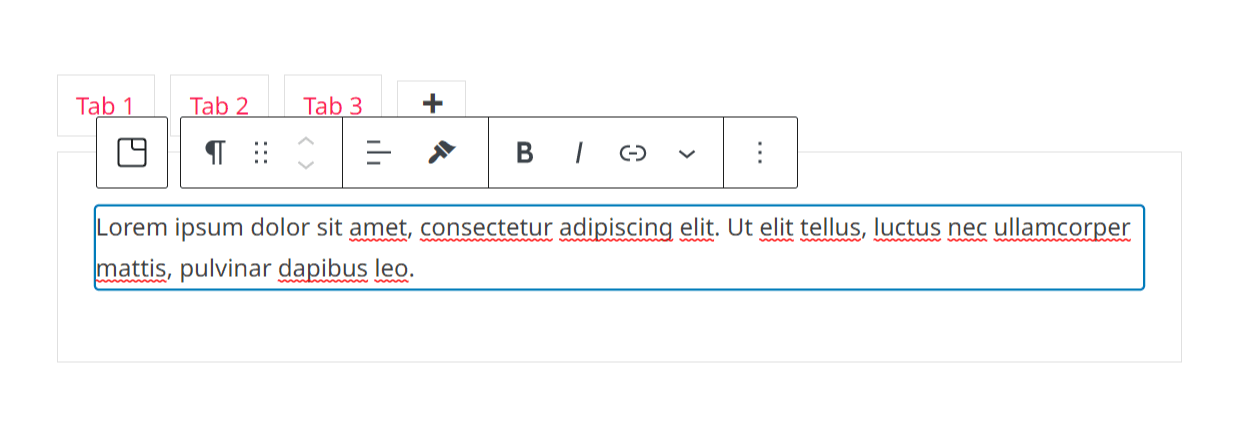
Let’s dive in and take a look at some features –
Key Features –
- Apply different Vertical layout styles and Horizontal Layout styles.
- Set Border, Margin, and Padding Stylings to the Tab Header and Tab body
- Choose which tab to set Open from the Initial Open Tab setting
- Add Icons, and modify Icon stylings in the tab header.
- Set Tab Header Alignment
- Style with body-color stylings and tab title color styling
- Icon Position and Spacing feature
- Box-shadow styling
- Add any child block or multiple child blocks inside tabs body
General Settings
Presets
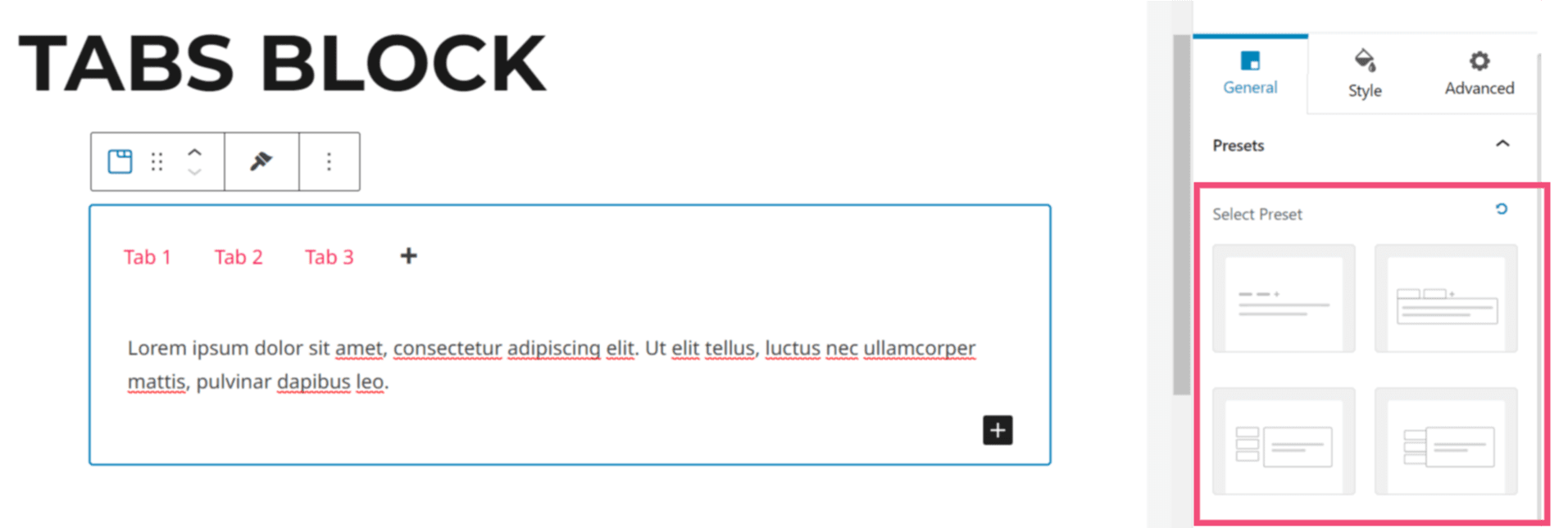
Spectra has revamped its feature into a new feature called Presets. This new update introduces the new Preset features to most of the modules in spectra. This new setting lets you quickly change any module’s design style and settings across your entire website with just a few quick clicks. This very helpful feature goes beyond what was possible before and will help speed up your website design process.
When you drag and drop the Tabs block in the block editor, you can see the block presets under the ‘General’ settings. You can select the block preset from here.
Layout
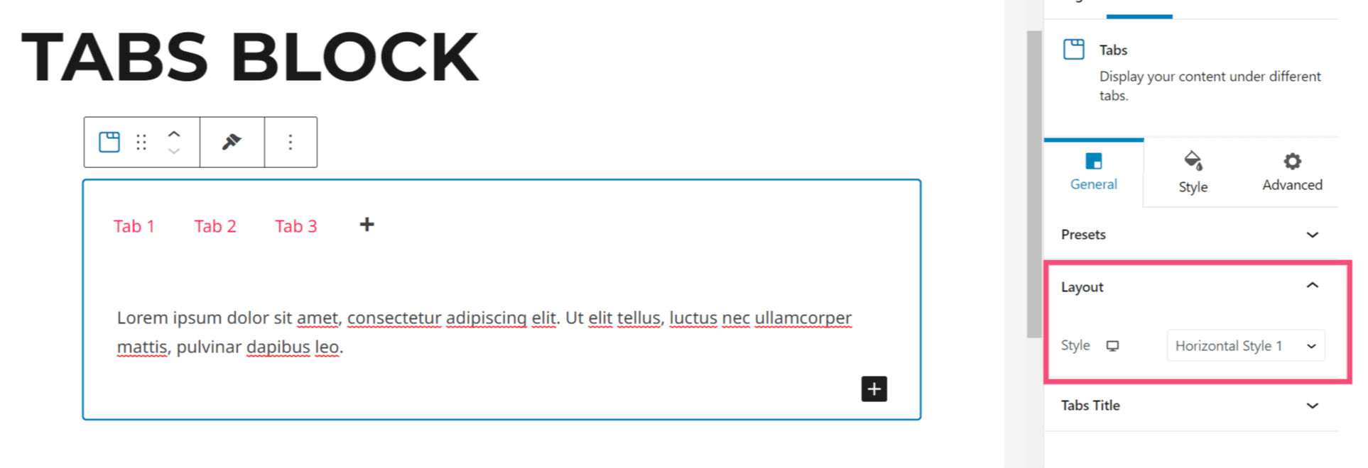
This section will help you select the right style to choose from 10 different layouts with 5 each of Horizontal and Vertical Styles.
Tabs Title
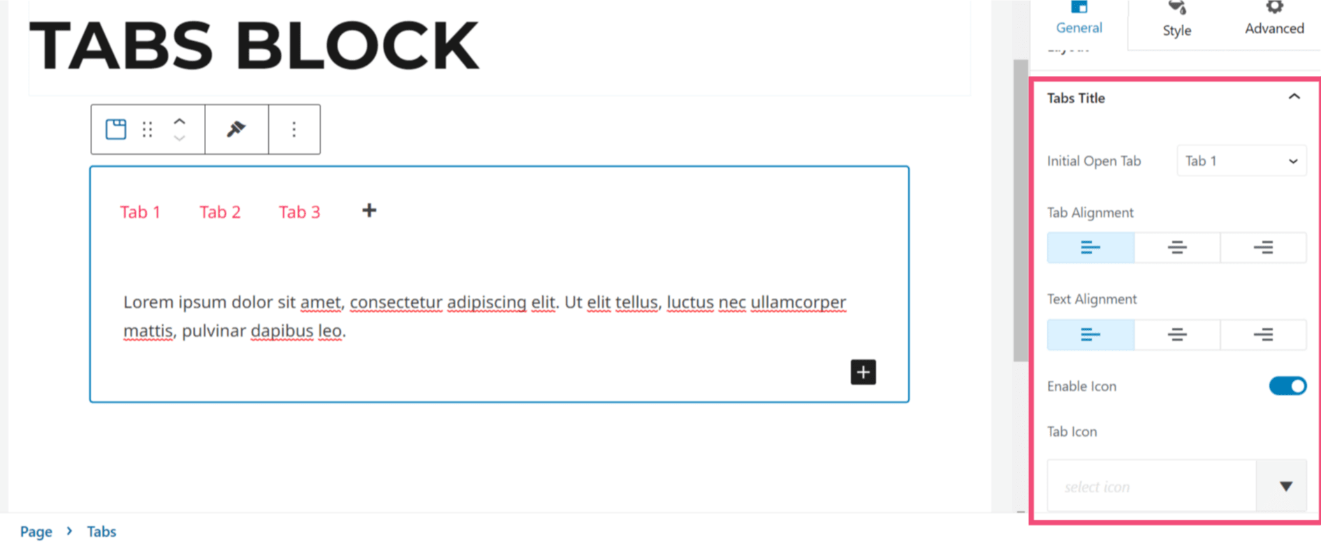
This section provides some options which has the setting for Initial Open Tab. Simply, we need to select the tab which will open by default.
Tab Alignment: This option aligns the Header Title under the Vertical Layout styles or while you have enough width on the Horizontal Layout styles.
Text Alignment: This option aligns the text to left, center, right.
Enable Icon: This option enables the Icon and displays another section which will allow you to select the tab icon and icon position.
Style
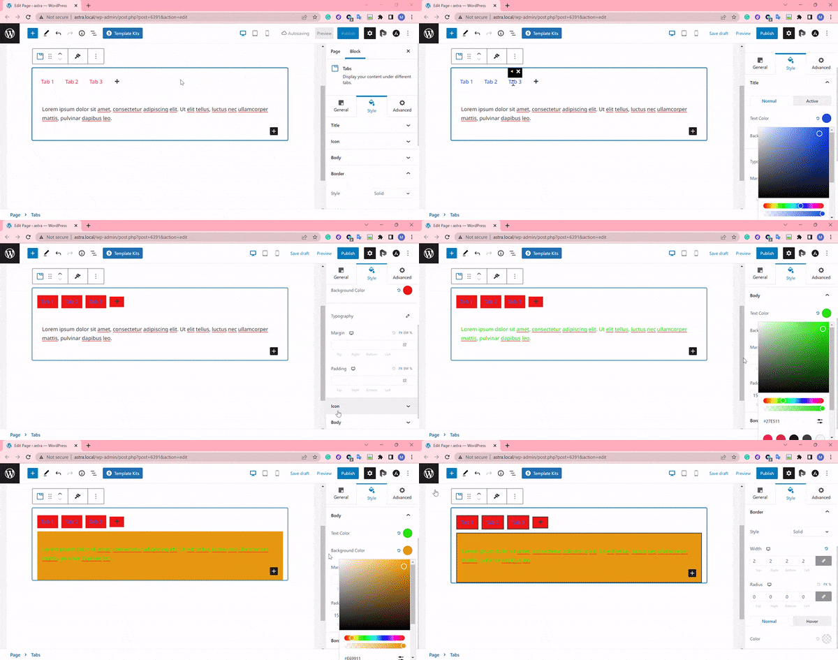
This section allows styling the body content of the tab blocks, tab title, icon, border.
Title: This option will help choose the color, background color, typography, margin and paddings for title text.
Icon: This option will help choose the color, size, spacings for the icon.
Body: This option will help choose the color, background color, margin and paddings for body text.
Border: This option allows selecting from the styles like Solid, Dashed, Dotted and many. This is an section right inside the Border Settings that allows managing the Border Color, Border Width, and Border Radius
We don't respond to the article feedback, we use it to improve our support content.