
- Container
- Buttons
- List
- Modal
- Slider
- Animations
- Icons
- Tabs
- Text Block
- Countdown
- Loop Builder
- Image Mask
- Dynamic Content
- Accordion
- Google Maps
- Separator
- Popup Builder
- Counter Block
- Login Block
- Register Block
- SVG Animator
- Block Positioning
- Post Block
- Spectra Header
- Motion Effects
- Responsive Conditions
- Display Conditions
- Spectra Global Styles
- Responsive Controls in Spectra Blocks
- Filters/Actions For Post
- Spectra Patterns
- Contact Form 7: Checkbox / Radio / Acceptance Control
- Getting Started With Spectra
- WP – Search
- Create Contact Forms
- Import Single Pages, Templates, & Block Patterns
- Assets API For Third-Party Plugins
- Copy & Paste Style
- Load Google Fonts Locally
- Troubleshooting: Missing Icons
- Contact Form 7: Multiple Column Fields
- Unable To Style Contact Form 7
- Tab Index For Multiple Gravity Forms
- Manually Install Spectra Via FTP
- Enable/Disable Design Library Button
- Update Folder File Permissions
- Resolving Container Layout Conflicts
- Database Update Instructions (Below 2.0.0)
- Transparent / Sticky Header
- Change Site Logo
- Change Global Styles
- Disable Title on Posts & Pages
- Transparent / Sticky Header For Single Page / Post
- Change Header & Footer Patterns
- Custom / Google Fonts
- Reset Global Default Styling
- Manually Install Spectra One Via FTP
- Enable / Disable Header & Footer On Specific Pages / Posts
Spectra Global Styles
Introduction
Global Styles is Spectra’s built-in design system manager. It lets you define your site’s colors, typography, and UI styling in one place, create your own CSS variables, classes, and keyframes, and apply reusable utility classes to any Spectra block. Everything now lives inside the block editor. There is no separate admin dashboard. You open Global Styles from any Spectra block and manage your entire design system without leaving the page you are editing.
How to Open Global Styles
- Select any Spectra block in the editor.
- In the Block settings sidebar, locate the Global Styles panel.
- Click Manage Global Styles to open the Global Styles window.
The window is organized into three sections in the left sidebar:
- Design System: The Style Guide, where you control colors.
- Custom CSS: CSS Variables, Classes & CSS, and Keyframes for advanced customization.
- Reference: Block Defaults, Token Browser, and Cheat Sheet to help you discover and apply what is available.
Style Guide
The Style Guide is the heart of your design system. Use the Shuffle button in the top bar to explore variations across the active tab. Locked items are excluded from shuffle, so anything you have finalized stays untouched. Click Save changes to apply your selections site-wide.
Colors
Your brand colors automatically expand into accessible shade ramps and section schemes, so you only need to set a handful of base colors.
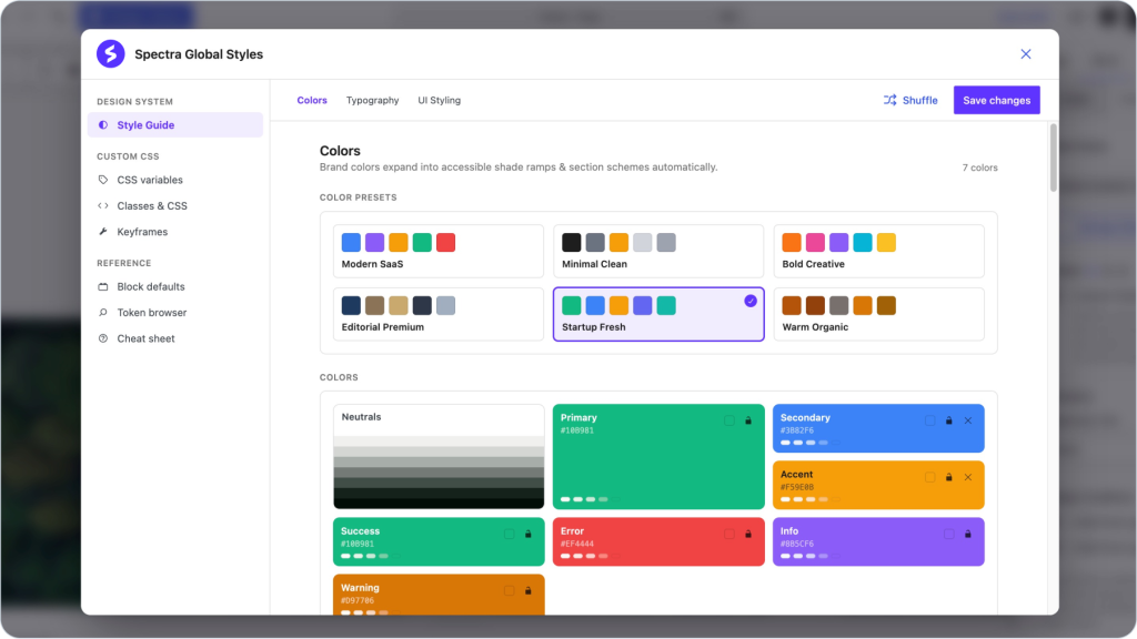
Color Presets: Ready-made palettes you can apply in one click, such as Modern SaaS, Minimal Clean, Bold Creative, Editorial Premium, Startup Fresh, and Warm Organic. Selecting a preset updates all brand colors at once.
Colors: Your active palette, shown as individual color cards.
- Neutrals: The grayscale ramp used for text, borders, and backgrounds.
- Primary: Your main brand color.
- Secondary: A supporting brand color.
- Accent: A highlight color for emphasis.
- Success, Error, Info, Warning: Semantic colors for states and feedback.
Each color card shows its hex value and generated shades. Use the lock icon to keep a color fixed, since locked colors are skipped when you shuffle, and the remove icon to drop optional colors like Secondary or Accent.
CSS Variables
Create your own CSS custom properties for use anywhere on your site. Custom variables are emitted inside a :root block, so any block or CSS rule can use them with var(–name).
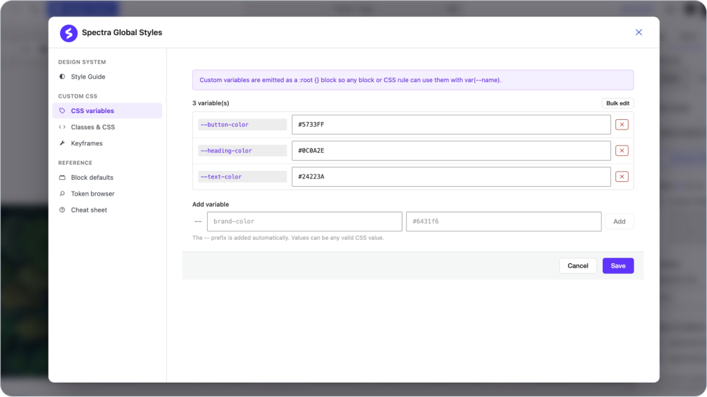
Adding a Variable:
- Enter the variable name in the Add variable field. The double dash prefix is added automatically, so type brand-color to get –brand-color.
- Enter the value. Any valid CSS value works, including colors, dimensions, fonts, and calc() expressions.
- Click Add, then Save.
Managing Variables:
- Edit: Change a value directly in its field and save.
- Delete: Click the red remove icon next to a variable.
- Bulk Edit: Edit all variables at once in a single editor.
Classes & CSS
Create reusable CSS classes with full state support and a live preview. All custom classes use the gs- prefix, which is added automatically.
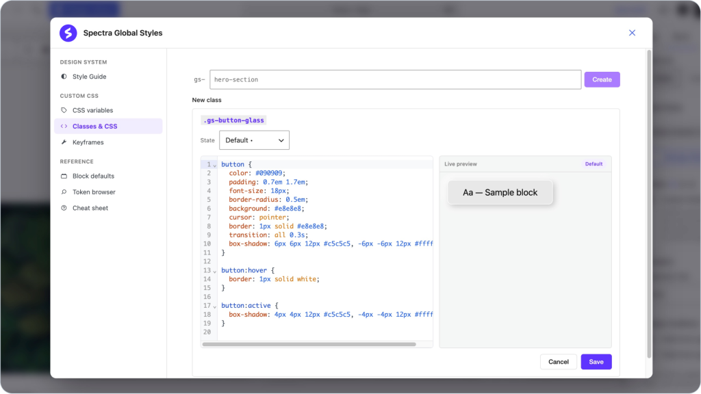
The Classes List: The main screen lists all your saved classes. Each entry shows the class name, such as .gs-button-glass, and its declaration count. Use the pencil icon to edit a class and the red remove icon to delete it. Use the search field to filter classes quickly as your list grows.
Creating a Class:
- Type a class name in the field at the top, for example hero-section. The gs- prefix is shown beside the field and added automatically.
- Click Create. The class is saved as .gs-hero-section and added to your list.
- Click the pencil icon on the class to open the editor.
- Choose a State from the dropdown. Default is the base style, with interactive states like hover available separately.
- Write your CSS in the code editor. Syntax highlighting and standard CSS are fully supported.
- Check the Live preview panel on the right, which renders a sample block with your class applied and updates as you type.
- Click Save.
Custom classes appear in the Global Styles dropdown on every Spectra block and in Block Defaults.
Keyframes
Create named CSS animations and use them on any block. Named keyframes are injected into the site stylesheet and can be used via animation-name in your custom CSS or the animate-{name} utility class on any block.
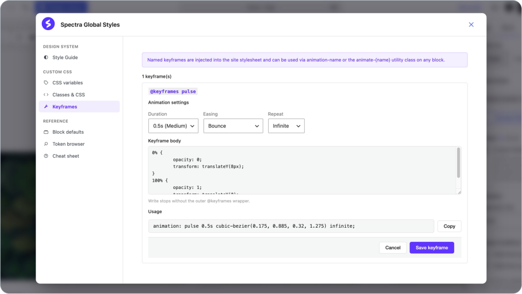
The Keyframes List: The main screen lists all your saved keyframes, such as @keyframes pulse. Use the pencil icon to edit a keyframe and the red remove icon to delete it.
Creating a Keyframe:
- Under New keyframe, enter a name, for example fadeIn.
- Set the Animation settings:
- Duration: Preset speeds, with 0.3s (Default) as the starting value.
- Easing: Timing functions such as Ease Out or Bounce.
- Repeat: How many times the animation runs, such as Once or Infinite.
- Click Create. The keyframe is added to your list.
- Click the pencil icon to open it and write the stops in the Keyframe body editor. Write the stops only, without the outer @keyframes wrapper. For example:
0% {
  opacity: 0;
  transform: translateY(8px);
}
100% {
  opacity: 1;
  transform: translateY(0);
}- The Usage field shows the final animation shorthand generated from your settings. Click Copy to use it in your custom classes.
- Click Save keyframe.
Block Defaults
Block Defaults pre-apply utility classes to every new block of a chosen type, so common styling happens automatically.
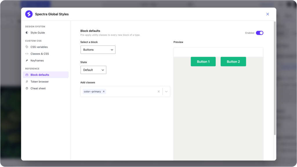
Configuring Block Defaults:
- Make sure the Enabled toggle at the top right is on.
- Select a block: Choose the block type from the dropdown, for example Buttons.
- State: Choose which state the classes apply to, starting with Default.
- Add classes: Pick one or more utility classes, for example color–primary. Selected classes appear as removable tags.
- The Preview panel on the right renders the block with your defaults applied so you can confirm the result before closing.
Every Spectra block also carries a removable default class, such as default-container or default-button. You can remove it from an individual block in the editor and re-add it later from the dropdown.
Token Browser
The Token Browser is a searchable reference of every design token generated by your Style Guide. Tokens are grouped into five tabs:
- Color tokens: All generated color variables with swatches and hex values.
- Spacing tokens: The spacing scale values.
- Radius tokens: Corner radius values.
- Shadow tokens: Shadow definitions.
- Motion tokens: Animation and transition values.
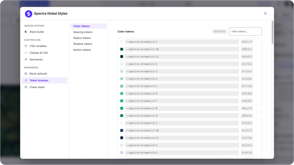
Use the filter field to find a token quickly, then copy its variable name for use in CSS Variables or Classes & CSS.
Cheat Sheet
The Cheat Sheet is a searchable reference of every utility class and variable available in Global Styles.
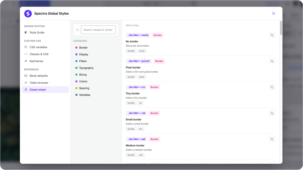
Search: Type in the search field to filter classes and variables instantly.
Category Filters: Narrow results by category:
- Border: Border widths, styles, and radius classes.
- Display: Layout, flex, grid, and visibility classes.
- Filters: Overlay and blur effects.
- Typography: Font size and line height classes.
- Sizing: Width, height, and aspect ratio classes.
- Colors: Text, background, and border color classes.
- Spacing: Padding, margin, and gap classes.
- Variables: CSS variables for use in custom classes.
Each entry shows the class name, a short label, a description, and tags. Click the copy icon to copy the class name, then paste it into the Global Styles dropdown on any block or into your custom CSS.
Applying Global Styles to Blocks
- Select any Spectra block.
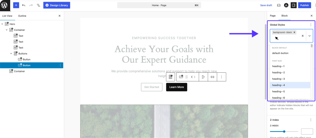
- Open the Global Styles panel in the block sidebar. Applied classes appear as removable tags, including the block’s default class.
- Click the dropdown to browse or search available classes. Classes are grouped by purpose, such as Block Default and Font Size, with utility classes like heading–4 or background–black available directly.
- Select classes to apply them instantly, or click the x on a tag to remove one.
- Click Manage Global Styles at any time to open the full Global Styles window.
CSS Priority
When multiple styles target the same block, they apply in this order, from highest to lowest:
- Block Settings: Options set directly on the block always win.
- Global Styles: Utility classes and custom classes applied through the panel.
- Default Block CSS: The built-in styling each Spectra block ships with.
- Theme CSS: Your theme’s styles act as the final fallback.
If a class does not seem to apply, check whether a block setting is overriding it, then clear your cache.
Frequently Asked Questions
Where do I find Global Styles now?
Global Styles has moved entirely into the block editor. Select any Spectra block and click Manage Global Styles in the Global Styles panel. There is no longer a separate admin dashboard screen.
Do Style Guide changes apply to existing content?
Yes. Colors, typography, and UI styling are applied site-wide through design tokens, so existing and new blocks update together when you save changes.
Can I still use my own class names?
Yes. Custom classes are created under Classes & CSS and automatically receive the gs- prefix to avoid conflicts with theme or plugin classes.
Where are my custom variables output?
Custom variables are emitted in a :root block on your site, so they are available to every block and every CSS rule via var(–name).
We don't respond to the article feedback, we use it to improve our support content.