
- Container
- Buttons
- List
- Modal
- Slider
- Animations
- Icons
- Tabs
- Text Block
- Countdown
- Loop Builder
- Image Mask
- Dynamic Content
- Accordion
- Google Maps
- Separator
- Popup Builder
- Counter Block
- Login Block
- Register Block
- SVG Animator
- Block Positioning
- Post Block
- Spectra Header
- Motion Effects
- Responsive Conditions
- Display Conditions
- Spectra Global Styles
- Responsive Controls in Spectra Blocks
- Filters/Actions For Post
- Spectra Patterns
- Contact Form 7: Checkbox / Radio / Acceptance Control
- Getting Started With Spectra
- WP – Search
- Create Contact Forms
- Import Single Pages, Templates, & Block Patterns
- Assets API For Third-Party Plugins
- Copy & Paste Style
- Load Google Fonts Locally
- Troubleshooting: Missing Icons
- Contact Form 7: Multiple Column Fields
- Unable To Style Contact Form 7
- Tab Index For Multiple Gravity Forms
- Manually Install Spectra Via FTP
- Enable/Disable Design Library Button
- Update Folder File Permissions
- Resolving Container Layout Conflicts
- Database Update Instructions (Below 2.0.0)
- Transparent / Sticky Header
- Change Site Logo
- Change Global Styles
- Disable Title on Posts & Pages
- Transparent / Sticky Header For Single Page / Post
- Change Header & Footer Patterns
- Custom / Google Fonts
- Reset Global Default Styling
- Manually Install Spectra One Via FTP
- Enable / Disable Header & Footer On Specific Pages / Posts
Block Positioning
Introduction
Block Positioning lets you move a block out of the normal page layout and place it exactly where you want. Turn it on, pick how the block should be positioned, and nudge it into place with simple offset values. It’s handy for overlays, floating buttons, badges, and any element that needs to sit somewhere the regular layout won’t put it.
Turning On Custom Position
Open the Position panel in the block settings and switch on Custom Position. Once it’s on, you can drag the block straight from the toolbar or use the arrow keys for small, precise moves. The rest of the settings below appear once the toggle is on.
One thing to keep in mind: a positioned block may look slightly different in the editor than it does on your live site. That’s normal.
Position Type
The Type setting decides how the block is positioned. There are three options.
- Absolute – Places the block at exact coordinates inside its parent container. The block lifts out of the normal flow, so the blocks around it act as if it isn’t there. Good for overlapping elements like badges on an image.
- Fixed – Pins the block to the browser window instead of the page, so it stays put as you scroll. Good for things you always want on screen, like a back to top button, a floating call to action, or a chat bubble.
- Relative – Keeps the block in its normal spot but lets you shift it with offsets. The space it would normally take up stays reserved, so nearby blocks don’t move. Good for small nudges.
Setting the Offsets
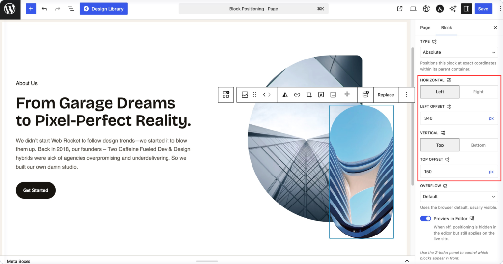
Offsets control where the block sits. You set one for the horizontal direction and one for the vertical direction.
- Horizontal – Choose whether to position from the Left or the Right, then enter the offset distance in the field below.
- Vertical – Choose whether to position from the Top or the Bottom, then enter that offset.
The offset label updates to match your choice, so picking Right shows a Right Offset field, and picking Bottom shows a Bottom Offset field. Values are in pixels.
Overflow
Overflow decides what happens when content inside the block spills past its edges. The default uses the browser’s usual behavior, which normally lets the content show. You can switch it to hide the overflow or add a scrollbar instead, depending on what you need.
Preview in Editor
This is on by default, so you can see the positioning while you build the page. If a positioned block gets in the way while editing, turn this off. The block goes back to its normal spot in the editor, but the positioning still applies on your live site.
Positioning Per Device
The device icons at the top of the panel let you set positioning separately for desktop, tablet, and mobile. This is worth using, since a layout that works on a wide screen can overlap or run off the edge on a phone. Check each size before you publish.
Controlling What Sits On Top
When positioned blocks overlap, use the Z-Index panel to choose which one appears in front. Higher values sit on top.
A Few Tips
- Use Relative for small nudges, and Absolute or Fixed for overlays and floating elements.
- Always check mobile. A fixed button or overlay can easily cover content on small screens.
- For Absolute, remember the block positions inside its parent container, so set the parent up the way you want first.
- Keep an eye on stacking. If a positioned block disappears behind another, adjust the Z-Index.
Troubleshooting
The block won’t move: Make sure Custom Position is on and that you’ve entered an offset value.
Absolute lands in an odd spot: It positions inside its parent container, not the whole page. Check which container the block sits in.
It looks right in the editor but wrong on the live site: The editor preview can differ slightly. Try toggling Preview in Editor, and always confirm on the front end.
The block is hidden behind another: Raise its Z-Index so it sits in front.
FAQ
Q: What’s the difference between Absolute, Fixed, and Relative?
A: Absolute places the block at exact coordinates inside its parent. Fixed pins it to the browser window so it stays put while scrolling. Relative keeps it in place but lets you nudge it without affecting nearby blocks.
Q: Can I set a different position for each device?
A: Yes. Use the device icons at the top of the panel to position the block separately on desktop, tablet, and mobile.
Q: Why does it look different in the editor than on my site?
A: Positioned blocks can render a little differently while editing. Use Preview in Editor to check, and confirm the final result on the live page.
Q: How do I stop two positioned blocks from overlapping the wrong way?
A: Use the Z-Index panel to set which block sits on top.
We don't respond to the article feedback, we use it to improve our support content.